5 Common Form Usability Mistakes
Web forms are important, and necessary. Forms are quite often crucial to successfully converting potential customers into sales or ‘leads’. From the humble contact form to bigger, multi-page data request forms: there’s no avoiding contact forms on the Internet. So why is it that so many people make the same form usability mistakes?
While designers and developers are busy arguing over how best to mark up forms, what they should be doing is optimising what they already have for maximum usability. A 2014 study by Mirjam Seckler et al. shows that when forms follow basic usability guidelines, the time it takes to fill in the form decreases significantly and users are almost twice as likely to submit the form with no errors on the first try.
So what are the most common form usability mistakes people make in constructing these crucial data collection aids? As a web developer, here are the 5 most common form usability mistakes I see clients and other developers make with their web forms:
1. Having too many fields
 It seems like having more fields would be a good thing: the more information you have, the better, right?
On the contrary, removing fields increases the likelihood that people will complete a form submission. Marketo’s lead generation test shows a significantly increased conversion rate using just 4 less fields on their registration form. For every field you have on your form, you are statistically more likely to decrease your conversion rate.
Think about the data you truly need to acquire from your mail form and cut the fluff: for example, on my professional website my contact form has just three fields: name, email address and enquiry. I don’t ask for common fields such as phone number (if customers need or want me to call them, they’ll provide a phone number in the enquiry field) or company name (most people state their company when they introduce themselves, and 9 times out of 10 it’s obvious from the email address anyway).
tl;dr: Keep form field quantity to a mimimum.
2. Making too many fields required
If there’s one thing worse than having too many form fields — which are visually off-putting and reduce conversion rate — having too many “required” form fields is an absolute killer. Why force your prospective customers not only to fill out an epicly long form, but to put down information you don’t need and they don’t want to share?
Arguably, if you don’t need a field it shouldn’t be on your form (see #1!) but it can often be easier to convince a manager or ‘higher up’ that you need to slim down your forms in the first place by making certain fields optional. As conversions increase, you can then make the argument for removing the field altogether.
tl;dr: Make as many fields optional as possible.
3. Relying on placeholder instead of labels
When HTML5 took off and the placeholder attribute was discovered, many designers rejoiced that they could finally get rid of unsightly or cumbersome <label> fields. Unfortunately, this decision was short-sighted and the antithesis of usability.
There are scenarios in which a placeholder won’t display, such as older browsers (and although a JavaScript fallback is possible, not everyone allows JavaScript in their browser!). There are occasions when a placeholder was displayed, but the user forgets the value of the placeholder after it has disappeared or they’ve started typing in data. Placeholders give no clues to errors when data is entered but does not meet formatting requirements. Less savvy users may mistake placeholders (especially when customised with CSS) for fields that have already been populated.
Furthermore, placeholders and labels have different purposes. A label describes a field, whereas the placeholder should demonstrate an example of the data expected.
tl;dr: Never use the placeholder attribute instead of the label tag.
4. Enforcing unnecessary formatting requirements
Sometimes, it’s necessary to take data in a certain format. Dates are a common example, but ambiguity can cause problems. Is 01/02/2016 the 1st of February or the 2nd of January? Should we enter in mm/dd/yy, dd/mm/yy, or even dd/mm/yyyy?
We can specify formatting requirements in placeholders or below fields to get around this, but not everyone reads field descriptions (and not everyone understands them), and if people try and fail to enter a date in a way they feel comfortable, the errors may put them off.
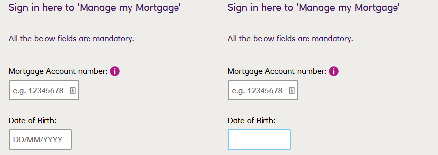
Worst still, combining usability mistake 3 and 4. In this example, Natwest’s ‘Manage My Mortgage’ login form has a date field with a format specified in the placeholder, but as soon as you click it, the format hint disappears. When you click out of the field, even without specifying data, the hint does not reappear forcing a page reload to figure out what it is you have to enter to log in:
We can get around this common trap by accepting data in one of two ways:
- By accepting multiple formats, and putting the onus on the data collection script ‘backend’ to deal with the confusion: e.g. accepting free text input for a name field, then forcing proper capitalisation in the code
- By using specific field types to format the data for us: e.g. using a date picker to allow users to choose the date visually, allowing the developer to pass the data back to the field in the preferred format
tl;dr: Accept as many variations of data as you can, and deal with the formatting yourself.
5. Having a reset button
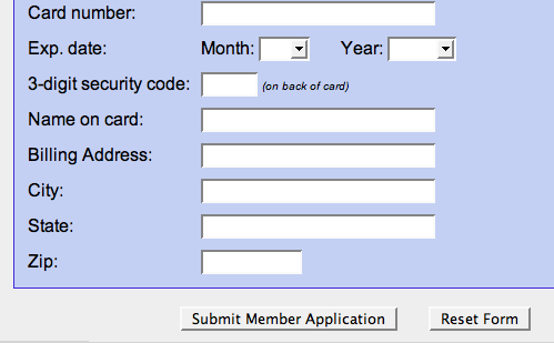 Oh, to have five minutes in a room alone with whoever thought it would be a good idea to provide a reset button for web forms. I can’t even begin to tell you how many times I have filled out a lengthy form, only to accidentally hit the reset button (which for some reason, are always placed right next to confirm/submit buttons) and lose all of my data and thus waste my time.
It is highly unlikely that a user would want to start filling in an entire form from scratch. Mistakes are usually easier corrected one by one. In 15 years of development I have not come across a single feasible or reasonable use case for having a reset button on a form.
tl;dr: Under no circumstances should you put a reset button on your form.
Avoid these 5 common form usability mistakes on your forms and you could see increased submissions, greater conversions and improved data collection in no time.